Thursday, April 25, 2013

A Little Progress Makes Me Happy

Good morning,

I've been asked quite a bit lately if I have pictures of my current project to share. Trust me I've wanted to share it, but there has been so much construction happening that it's just not been "show you" ready. I did take a couple of candid i phone pictures to show you some of the progress. I'm still in construction with bathrooms and the new AMAZING stair case which will be coming HOPEFULLY next week after which things will really start shaping up.

In the mean time here are a few Progress Before And After pictures for you.


Foyer Before:


Foyer In Progress:


Man Office Before:


Man Office In Progress:


 Kitchen Before:


Kitchen In Progress:


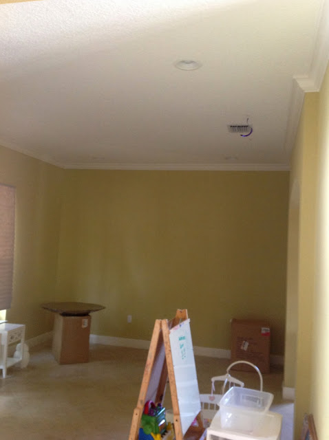
Family Room Before:


Family Room In Progress:


Now clearly these aren't top quality pics, simply taken from my I phone. This is in no way a representation of what's to come since things are very much in progress, but at least you can get a feel for the transformation that this home is undergoing. The once dated home is getting its clean and polished make over for the stylish guy that lives here. It's turning out amazing, and I can't wait for things to keep on changing. I will share more with you as it comes, but this place cleans up really nice, don't you think?


Wednesday, April 24, 2013

Possibly The Most Versatile Table Ever, The Saarinen Tulip Table

Good morning,

Today I wanted to talk about one of my favorite mid century modern pieces of furniture EVER! OK, I have quite a few "favorite pieces ever" but not all are quite so versatile.

For my current project I chose the famed Saarinen Dining collection Tulip Table. This table was originally introduced by Knoll in 1956. I always love something that can tell a good story. I chose this table because the kitchen is a bit dark with Wenge wood cabinets as well as a pretty dark granite that I salvaged from the previous kitchen design. Bringing in this table is like injecting some light to the space. I also went with a large drum pendant and white bar stools to keep things brighter.

Remember the Breakfast nook scheme?


Well, this scheme changed many times with my ever changing mind. Take a look at the other chair and lighting options as things evolved.


This sometimes happens as other parts of a space come together, or when a client doesn't like something like the Cherner bar stools or the Wishbone chairs ( I can't win em all). I finally settled on the metal dining chairs from Cb2 because my client loves all things metal (I learned), and isn't a fan of anything "walnut". Funny. None the less, going through the process made me want to share with you how versatile this table can be. It comes in many finishes, color variations and sizes. You can even go with an oval shape and use it for a larger dining room. Find one here .


So on to the title of today's post. You don't have to take my word for it, feast your eyes on the MANY rooms that the Tulip table has been styled in. Not to mention how many chair options work perfectly with it.


I'm in love! What do you think, do you like how this iconic table can be used in today's modern times or are you not a fan of bringing back the classics?

Though mid century pieces might not be for everyone (gasp!) one thing is for sure, you can definitely see that this table will pack a space with style. It's like a neutral heel and how that can pull an outfit together effortlessly. This table effortlessly polishes off any room it's put in, and is a keeper in my book.

Friday, April 19, 2013

This Or That, Masculine Bedroom Design

Good morning,

Since my current project is geared mostly around my male client I've had to keep that in mind with the design and style of the space. It's actually been quite interesting for me to push my boundaries and try many new things which is always fun.

Today I want to share with you the master bedroom schemes that I've come up with. I'm deciding between two bed options. Option A with a low braided leather head board or Option B with a high leather head board.

Take a look.


Option A


Option B


In either case the bed would work fine, the only real difference is the height of the bed. In Option A I would have the versatility to hang art above the bed due to the low height, and in Option B the headboard's height becomes the focal point.

Here are some bedrooms that have art hung above the bed.


And here are some bedrooms with high upholstered head boards.


All of these bedrooms are quite amazing! I'm kind of obsessed with the Maralyn Minter art hanging above the very first image, but I also love the simple high white head board set against the all white walls and crisp white bedding which I am a huge sucker for!

What do you think? Would you prefer to hang art above your bed and go with Option A or do you like that Option B has a tall enough bed that it doesn't need art?

Monday, April 15, 2013

Project Sneak Peek, A Couple Mood Boards To Keep Things Going

Good afternoon,

I wanted to share with you a couple more mood boards in my Global Inspired Project. This week is a buy one with 2 bathrooms being overhauled, the new kitchen cabinets getting installed and the lighting to start being installed on Saturday. I will hopefully have images to share with you soon.

One of the boards I'm sharing with you today is for the new kitchen. Take a look.


The old kitchen started from this:

Kitchen Before:


With the light laminate cabinets, and dated lighting and furnishings this kitchen was in no condition to stand up to our new modern design scheme. I am adding dramatic wenge wood cabinetry with flat paneled doors and clean black hidden pulls.


For the furnishings and lighting I will accentuate the new kitchen with some touches of mid century modern  such as the famed tulip table circa 1956 and balancing that with industrial touches such as the metal chairs and the industrial pendant lights for the island.


It's very minimal and clean, and perfect for a neutral updated kitchen. I also chose smaller scale bar stools to accommodate for 4 instead of 3.


The other mood board I'm sharing with you today is for the area right before you exit to the pool. It is a wide open space with a recessed tray ceiling that needs something special but can't necessarily block off that area completely or its lovely view to the outside.

Here's what I came up with for that space.


The Lights have a resemblance to sea urchins and are made from straw like sticks. There will be 3 total in varying heights hanging above the table. They are very raw and organic and absolutely make a statement.

I used another ode to my mid century obsessions with the Platner table by Knoll circa 1966. This little gem of a table has a wire base and a glass top to it doesn't take up too much visual space.

Below the table will be a few orchid sculptures created by yours truly. I will reveal those results when I get there, but I'm excited to make another orchid sculpture and will have more of those coming soon to The Cuban In My Coffee for sale if you are interested in orchid sculptures for your own home. 

Since these two spaces are side by side, I grounded them with white and light accents to unify them. The mix is quite a perfect balance with masculine elements mixed with just a few touches that still keep it light and airy and not too industrial.

What do you think? Not too bad for a bachelor pad that's coming along quite nicely don't you think?

Monday, April 8, 2013

Project Sneak Peek, Small Changes Big Impact

Good morning,

So I fell off the face of the Earth for a bit. I haven't really, but I have been very busy with work and life and all things productive. My Globally Inspired bachelor pad has been undertaking MAJOR changes, and today I want to share some of them with you.

When working on a project and updating a space you have to address what spacial issues, architectural designs and the basic style of the home itself and figure out what changes will work with your new design scheme. Sometimes this can be achieved with simply painting a space. In the case of my current project I had to remove certain decorative features to simplify the style, remove interior walls to open the space up, change the entire color palette, change the entire stair design and I even changed some small things like window trims and outdated arches to make the space more modern and current. These little details can change your home completely, and should never be over looked when possible.

Take a look at some of the changes I've been making and how those changes are impacting the overall look and style of this house.

Changes to the front door:

Before:


After:


Note that the door was a beautiful door with the iron scrolling details. Simply removing, sanding, patching and painting these doors gave them a modern face lift without the added costs of replacing the entire front doors.

Interior walls and demo:

Before:


After:


  Note that before the dated colors and segmented walls were clearly not marked for a modern transition. This is one example of a room where we removed interior walls and arches which then gives us more space and an open floor plan. This also changed the feeling of the room from being a dark cave to what it is now, light and airy. I also removed all archways throughout this home that I'll show you down the road. Removing interior walls ALWAYS makes a home feel larger. It is a trick that use whenever possible.

Stair Case Transition In Progress:

Before:


Since these stairs are in progress as we speak I don't have the afters for you so in the mean time I will share with you the inspiration and designs. Clearly these wood and scrolled iron details don't scream sexy bachelor pad, and that's a very difficult thing to work around since they are visible from almost every angle of the home. This is one area that we splurged with the budget to make them go from the dated style that you presently see to a work of art. Here are some examples of what is to come. 


The plan is to transform the stairs completely. We will be doing this by removing all iron work and inserting clear glass panels held by stainless steel brackets. In the case of this home that isn't 100% contemporary I am going to use powder coated hand rails in a dark gray/brown finish just to keep things a bit sultry. The beauty of these stairs is that they will still reveal the dark wood floors that were recently installed throughout the entire upper level, but they also mix in our masculine and industrial touches with the glass and metal rails. I'm not going to lie to you, this is probably one of the biggest things that I am looking forward to seeing completed. Come on, how amazing are these stairs?!

I'm sorry for the lack of postings, and I will share elements with you as they continue to change. This week I have 2 bathroom installations, and lighting will start going in. I have some pretty amazing lighting happening that is literally to die for that I can't wait to share! I'll also reveal more room inspiration boards.

Happy Monday!!!