Good morning,
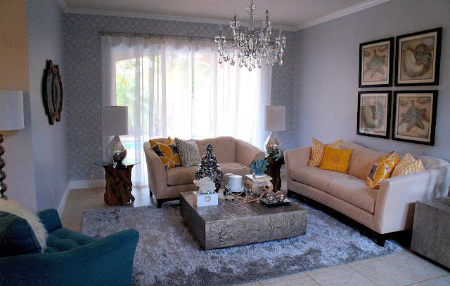
Today I want to share with you some of the after pictures for my Beach Chic project. You've seen a couple sneak peek pics of it, but not the finished results. This project was for a small family who wanted an updated a fresh look in their home. There were some pretty good basics going on, but the space needed to be tied together especially since all the rooms flow together.
Take a look at some before and after pictures.
Sometimes in a project I have to work around existing furnishings or colors due to a client's liking or budget. In this case there are some main items such as the "big red" sofa and the dark furnishings in the dining room that posed a challenge. There is also a lack of lighting in this home, and it wasn't in the budget to go with the over head lighting that we originally wanted. There are also challenges with builder's model type homes where you have basic flooring and moldings and not much else in the way of character. In this case the details go a long way to dress the home up and make it unique. To overcome this we anchored the space with a light modern grey throughout and added accessories, lighting, draperies and accents all in polished light tones and eye catching focal points.
I worked closely within the client's budget being careful with what was chosen and where we spent. There were many DIY projects here, and the client was amazing and took on many of the extras where ever needed to make the budget work. In the end there were things that had to be cut off the list such as extra lighting or draperies, or the large scale art for now, but overall this home is absolutely beautiful and looks and feels complete.
The goal here was to unify all the existing elements which was what the home owner found challenging, after all it's not easy to make a large red sectional feel current. I would say that goal was accomplished and the rooms flow well with the main obstacles over come.The home owners love their new space and it was a pleasure making it happen. I love the feeling that you get when you walk in it feels like a breathe of fresh air. It's also amazing how much larger it feels with things such as the well defined foyer and the large scale chandeliers.
What do you think of the finished results?
Today I want to share with you some of the after pictures for my Beach Chic project. You've seen a couple sneak peek pics of it, but not the finished results. This project was for a small family who wanted an updated a fresh look in their home. There were some pretty good basics going on, but the space needed to be tied together especially since all the rooms flow together.
Take a look at some before and after pictures.
Foyer Before:
Foyer After:
Living Room Before:
Living Room After:
Dining Room Before:
Dining Room After:
Family Room Before:
Family Room After:
Sometimes in a project I have to work around existing furnishings or colors due to a client's liking or budget. In this case there are some main items such as the "big red" sofa and the dark furnishings in the dining room that posed a challenge. There is also a lack of lighting in this home, and it wasn't in the budget to go with the over head lighting that we originally wanted. There are also challenges with builder's model type homes where you have basic flooring and moldings and not much else in the way of character. In this case the details go a long way to dress the home up and make it unique. To overcome this we anchored the space with a light modern grey throughout and added accessories, lighting, draperies and accents all in polished light tones and eye catching focal points.
I worked closely within the client's budget being careful with what was chosen and where we spent. There were many DIY projects here, and the client was amazing and took on many of the extras where ever needed to make the budget work. In the end there were things that had to be cut off the list such as extra lighting or draperies, or the large scale art for now, but overall this home is absolutely beautiful and looks and feels complete.
The goal here was to unify all the existing elements which was what the home owner found challenging, after all it's not easy to make a large red sectional feel current. I would say that goal was accomplished and the rooms flow well with the main obstacles over come.The home owners love their new space and it was a pleasure making it happen. I love the feeling that you get when you walk in it feels like a breathe of fresh air. It's also amazing how much larger it feels with things such as the well defined foyer and the large scale chandeliers.
What do you think of the finished results?


No comments:
Post a Comment